PayAnyone launched in 2017 as a bare-bones app built around one function: sending money to another person. By 2019, it had grown into OCBC's flagship consumer payments platform, with 400,000 active users, over 3 million transactions, and more than $200 million moved through the app.
Getting there meant rebuilding the app's structure more than once as its purpose kept expanding past what it was originally built for.
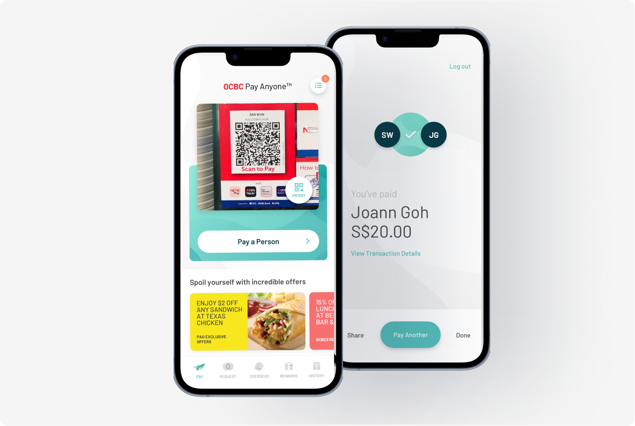
The rebuilt navigation gave the app room to keep adding payment types, merchants, and channels without a full redesign every time something new got added.
Growth stayed anchored in the same social-payment behavior that justified the redesign in the first place.
Three versions, each outgrowing the last.
PayAnyone didn't arrive as a platform. It became one, in stages, as the bank's ambitions for it kept expanding.
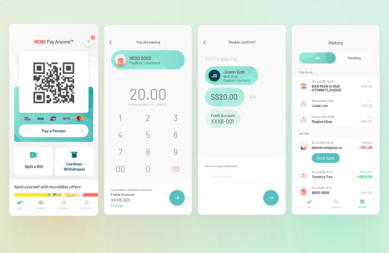
Early PayAnyone did one thing well: transfer funds between two people. That simplicity was the point. It made the app usable by anyone with a bank account, not just people already comfortable with fintech apps.
But the bank's digital strategy was pushing PayAnyone toward a bigger role: reach a younger, more digitally native customer base, support merchant payments, bill splitting, requests, and a deals marketplace. Each feature had a sponsor somewhere in the business, and each assumed the app could absorb it without changing how people found their way around.
The clearest signal came from who was actually driving the app's growth. Merchant integration was the initiative the business had prioritized, built to drive revenue.
But the fastest-growing user segment wasn't merchant customers. It was tertiary students using PayAnyone to split bills and request money from friends: a social use case nobody had explicitly designed for.
That was an opening. Splitting and requesting money were behaviors people had already brought to the app on their own, ahead of any feature built to encourage it. Leaning into that turned social payments into a growth lever in its own right, and gave the app a second reason to open it beyond a single transfer.
The gap between where the business was investing and where usage was actually accelerating became the argument for changing the roadmap conversation.
Version 3.0 wasn't a visual refresh. It was a navigation rebuild.
I made the case to restructure the navigation around how people were actually using the app, increasingly social rather than purely transactional, instead of around whichever feature had shipped most recently. That meant sequencing decisions: some social payment features got prioritized ahead of merchant asks that had stronger business sponsorship, because the usage data said that's where the growth was.
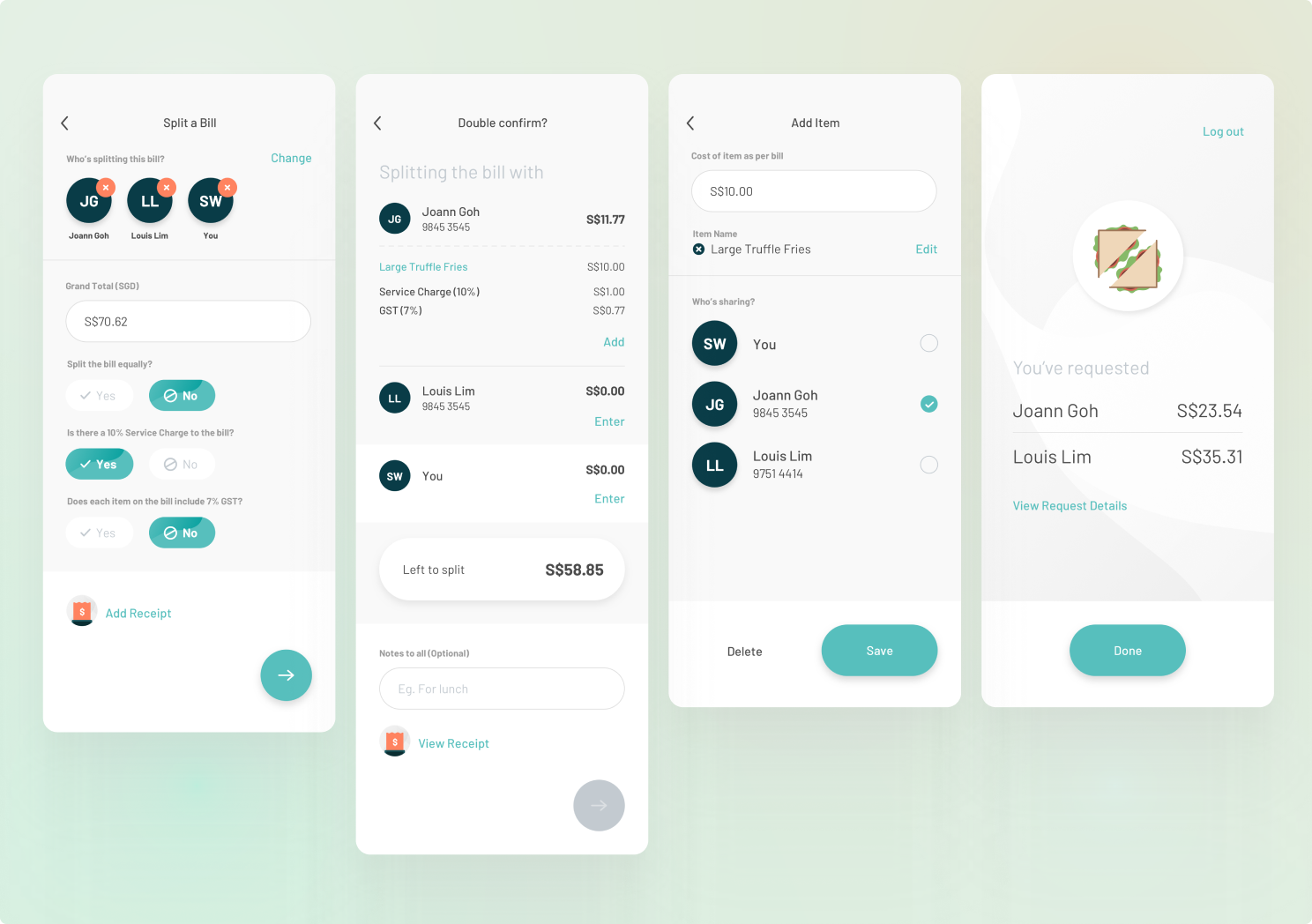
Sequencing calls like that don't happen by assertion. As experience lead, my job was less about producing screens and more about defending a roadmap to product owners, IT, and outside design agencies, each with their own priorities.
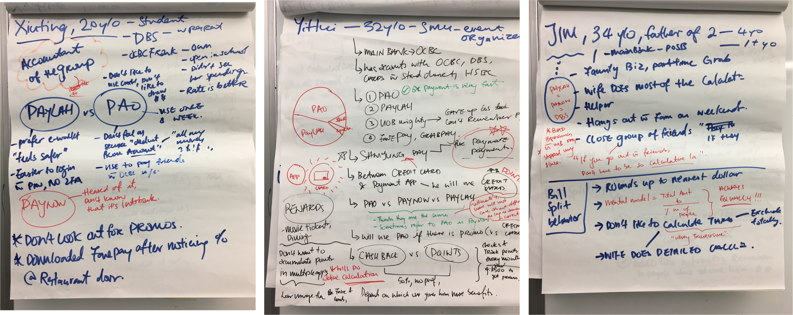
Research was the currency. Usability feedback, validation testing, and usage patterns became the evidence I used to argue for tradeoffs, especially when a business ask conflicted with what was actually working for users. That process shaped which features got built, in what order, and which got pushed back.
An app that keeps expanding never runs out of businesses asking for a slice of it. The actual job wasn't designing any one feature. It was building a process, research-backed and repeatable, for deciding what got built first and what could wait.
That process outlasted any individual redesign, and it's what let PayAnyone keep adding payment partners without losing what made it usable in the first place.